How to analyze an Insight
Watch this short video to walkthrough how to analyze an insight.
Toggle AI is now Reflexivity! Click here to go to our new website
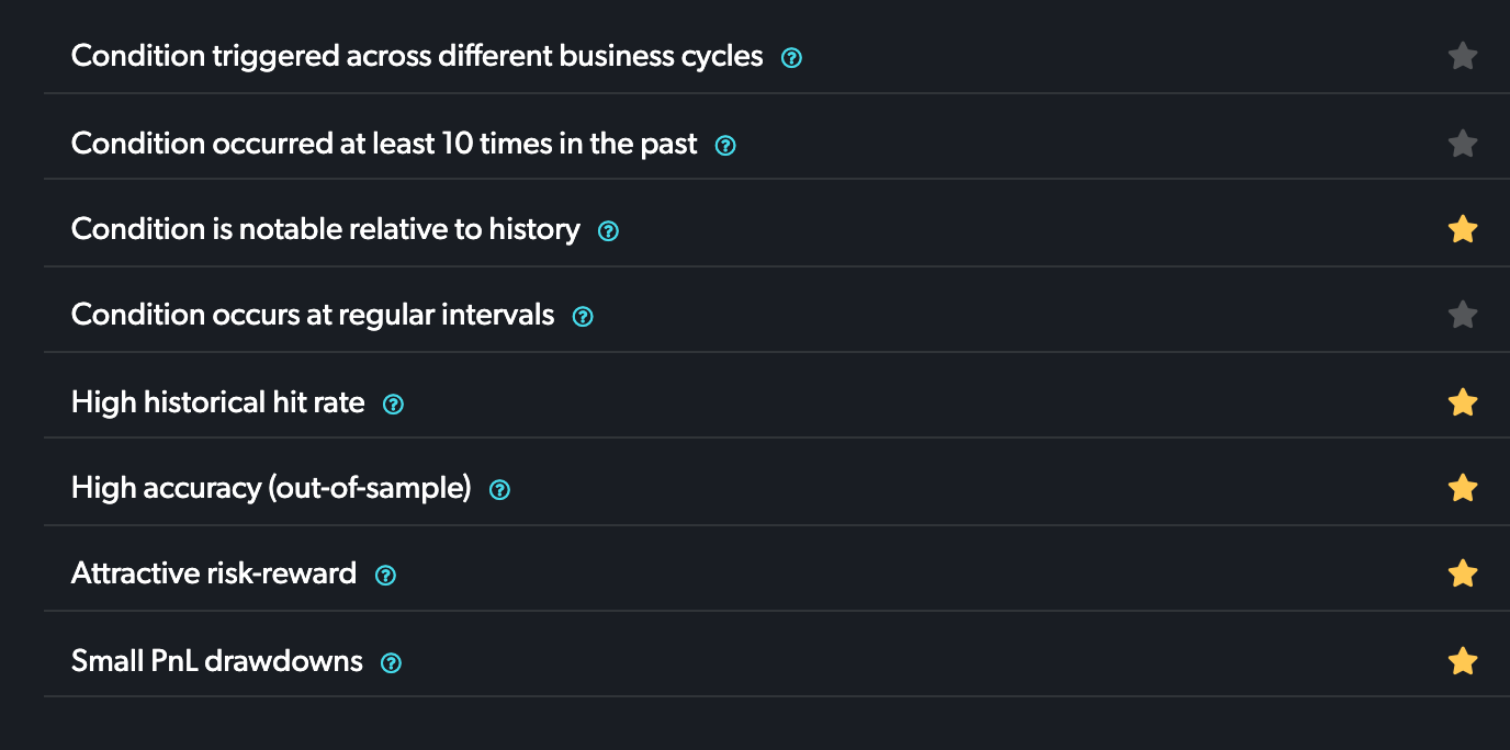
Stars represent quality checks: robustness across business cycles, frequency and sparseness of the pattern, and strength of backtest and risk/return profile.
When TOGGLE provides forward price paths based on historical price patterns, several things are shown. The green line represents the security's median return, and the shaded area represents the confidence interval around the median path. The "optimal" horizon will appear highlighted, a blue-green if positive and red if negative. All other boxes are not shaded.
For example, the below shows a bullish pattern in American Express, where the horizon selected is a 3M holding period.
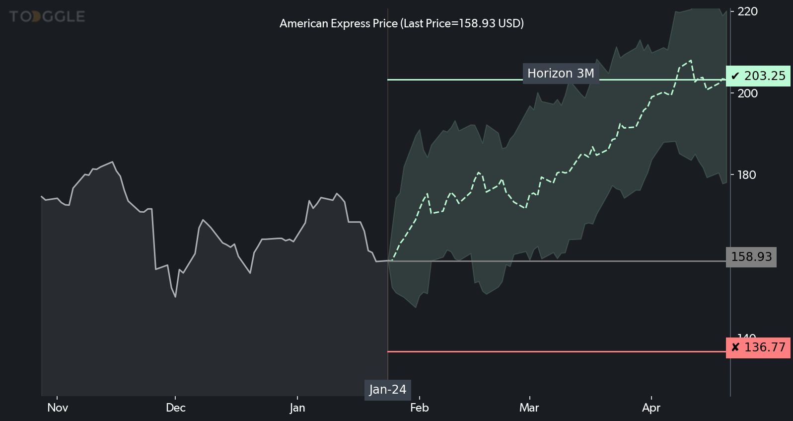
The horizontal red line is a possible re-evaluation or stop-loss level: it signifies the point where price action has deviated too far from the expected path and the insight is invalidated. The horizontal green line indicates the level the asset is expected to reach if historical analogs hold.
The shaded area represents a confidence band and the actual price typically stays within those boundaries. The horizontal green line indicates the level the asset is expected to reach. The horizontal red line is exactly 50% of the level of the green line, in the opposite direction. Professional traders often set a price level they expect to reach, and use 50% of that level in the opposite direction as a way to start thinking about a possible stop-loss level. Similarly, option traders often construct option structures with a clearly defined risk-return, like 2:1 or 3:1. The red line in TOGGLE insights provides a visual cue to help these structuring exercises, but should not be taken as a literal instruction on where to set a stop-loss.
You can find more detail on the intervals themselves in the table below:
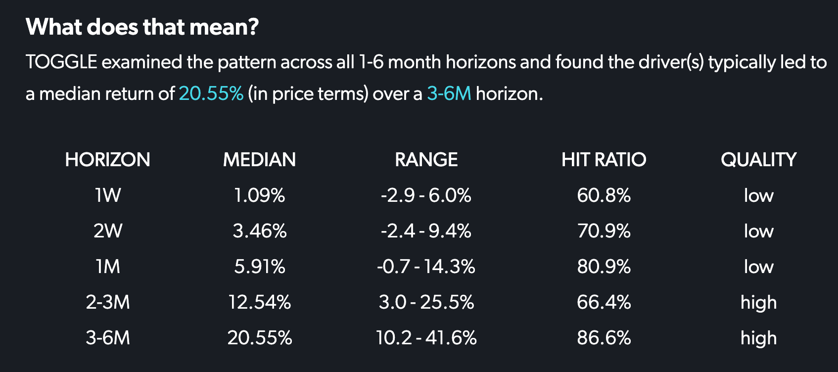
TOGGLE assesses the accuracy of each signal across many horizons. We report the horizon that shows the biggest statistical shift of its distribution, relative to baseline. A summary of all horizons examined can be found in the "what does that mean" section.
TOGGLE's system continuously monitors hundreds of thousands of time series, searching for and detecting interesting developments that may be relevant to users. It scans for compelling milestones in data series, including new highs and lows, among other signals. It's on alert for emerging trends (characterized by a persistent move up or down over a longer time period), a move through zero or other important barrier, and sudden large moves up or down
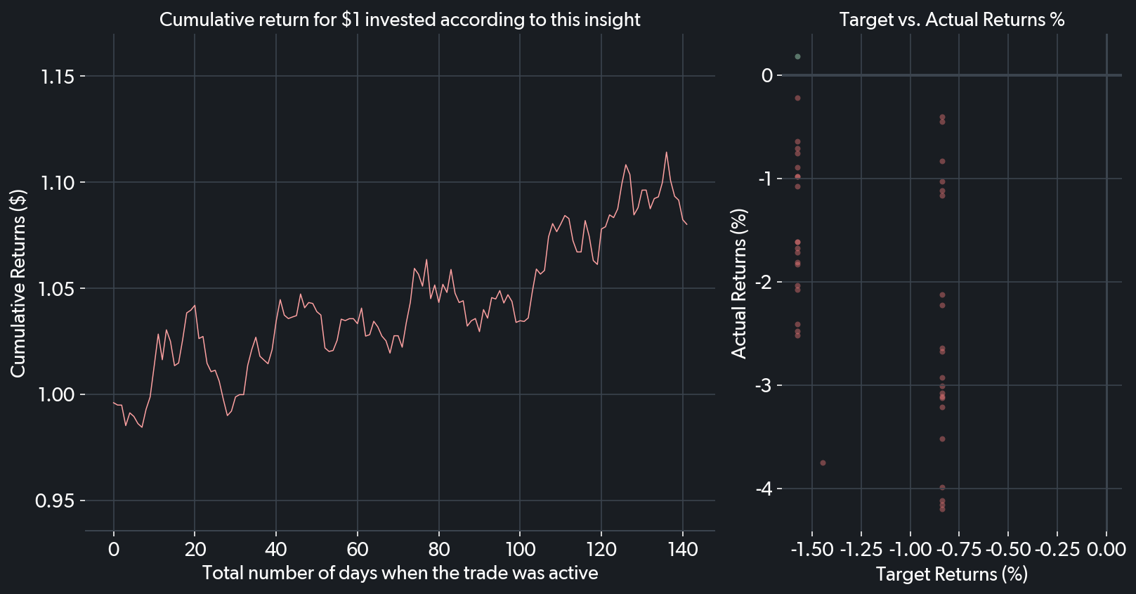
To give you a sense of the insight's profit potential, the line chart shows the cumulative return from trading on this insight each time it appeared in the past, starting with $1. Ideally, an insight has a high cumulative return and small drawdowns (left graph).
The scatter plot visualizes how well the insight performed out of sample. The x-axis shows the expected returns given the insight conditions, while the y-axis records the actual returns the security realized. A perfect foresight would see complete alignment of expected and actual returns along the 45° diagonal. The scatter plot shows the actual past returns based on this insight, to help compare the risk of losses vs. potential gains. Each of TOGGLE’s insights is rigorously backtested to help you assess its accuracy (scatter plot - right)
What is a TOGGLE Insight?


